
Improving the Notion Note-Taking Experience on Mobile - A Redesign
Meta-learning project #1

Two weeks ago, I started my meta-learning experiment, exploring how far I can go with intensive, self-driven learning. My first topic is visual design, something I have zero experience with prior. After spending 1 week learning Figma, I challenged myself to redesign Notion mobile UI to improve users’ note-taking experience.
Why Notion?
Because I love Notion!! Notion on desktop perfectly hits my type-A aesthetic nerves. I organize my journals, projects, and daily errands all on Notion. However, the Notion mobile app is quite clunky. Users beg Notion to improve their mobile app on Twitter and Reddit and even gave each other tips to simplify Notion’s mobile experience on Youtube. Therefore, I found it a worthwhile challenge to improve Notion’s mobile app via a redesign.

Figjam Brainstorm - Mobile Use Cases, User Journey, & Pain Points
I would have interviewed existing Notion desktop users who are not yet engaging with the mobile app. However, given this project’s time constraint, I utilized my intution as a power user. Notion is my third-used app aside from Messages and Google Maps. Based on my own user experience in addition to user feedback online, I brainstormed the major Notion mobile use cases on Figjam.

Users usually use Notion on PC to set up extensive pages or databases and use Notion’s mobile app to view existing content, make quick edits, or take short notes. Based on this assumption, I laid out a typical user journey:

Then, I came up with pain points involved in each step of the user journey. I realized, many pain points have to do with
cluttered interfaces due to the restricted space on mobile
difficulty to find what I need due to the unintuitive design

Prioritization & Redesign Ideas
I prioritized pain points related to the core note-taking experience: making content edits, inserting new content, styling, and additional page actions. I chose to focus on these features because 1) the note-editing experience is universal to the majority of Notion mobile user journeys and 2) these pain points cause Notion to lose its desktop users to Apple Notes and Google Keep for taking quick notes. If we want to improve mobile engagement and make Notion a comprehensive personal and professional workspace, we need to improve the app’s most basic workflows such as note taking.
I decided to make the following improvements:
Declutter the toolbar on top of the virtual keyboard: currently, users need to scroll through the tiny toolbar to see all buttons, and the most important options like redo and undo hide at the very end. Additionally, the buttons are so small that I am often afraid that I’ll click on the wrong thing.

Streamline the process of finding styling options: Notion does a good job of automatically prioritizing styling options for you. For example, if you are editing a bullet list, the indent options are at the front of the toolbar. However, otherwise, we often need to navigate through layers before finding what they need. For example, users go through a 4 step process to do something as simple as highlighting a block of text: 1) scroll to the right of the toolbar, 2) click on the text style icon, 3) scroll down the second screen, 4) choose a background color.
Make it easier to find a block to add: On desktop, the “/” shortcut makes it simple to search for the block you want to add. However, on mobile, it’s a lot of work to scroll through all options, especially if what you need is at the bottom of the list.

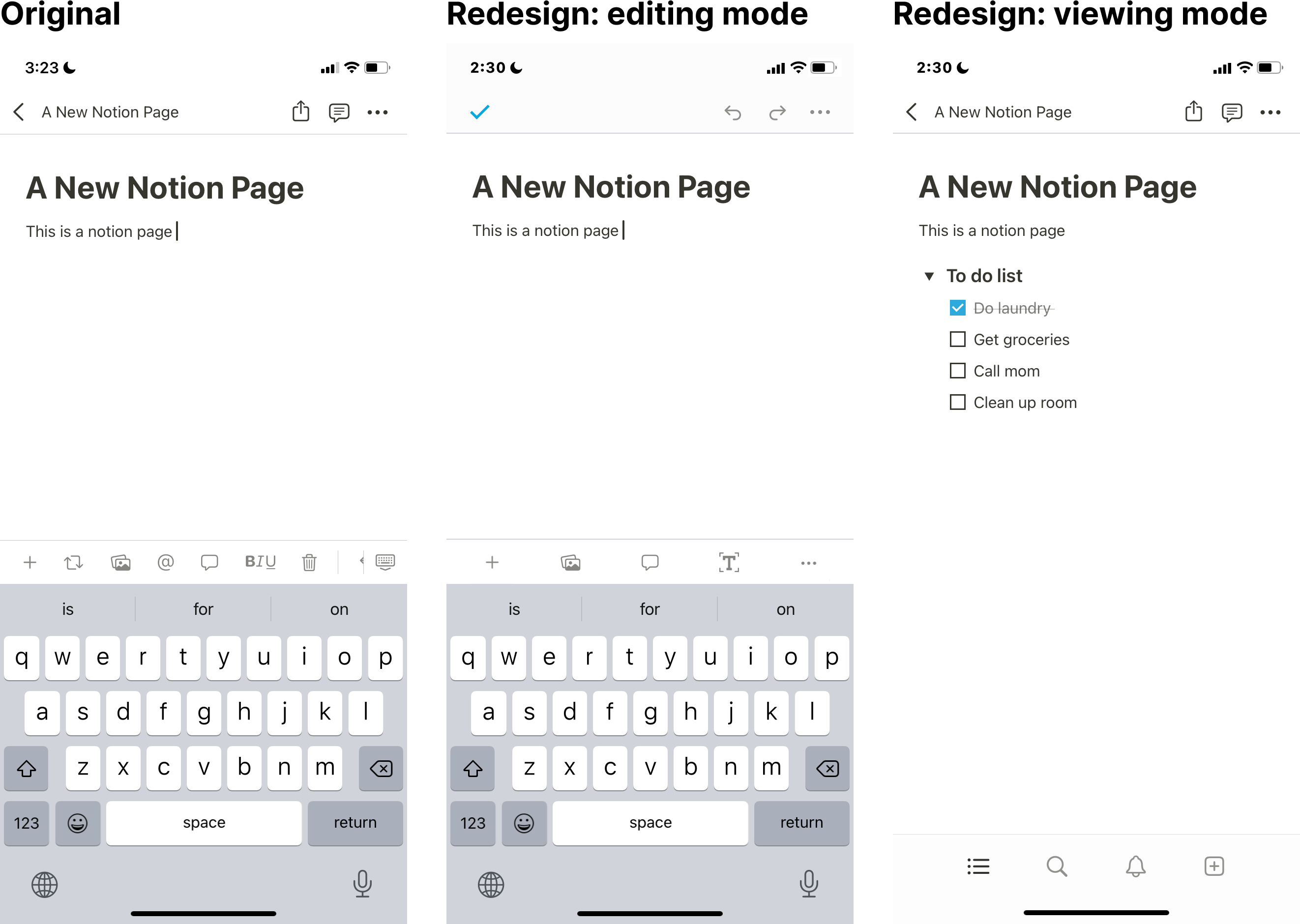
Distinguish edit and view modes: When I am viewing content on Notion, I often accidentally make edits I don’t intend to keep and can’t easily undo them. On the other hand, after I finish editing, there is no way to signal that I’m done aside from hiding the keyboard, which isn’t an intuitive indicator of saving changes and entering viewing mode.
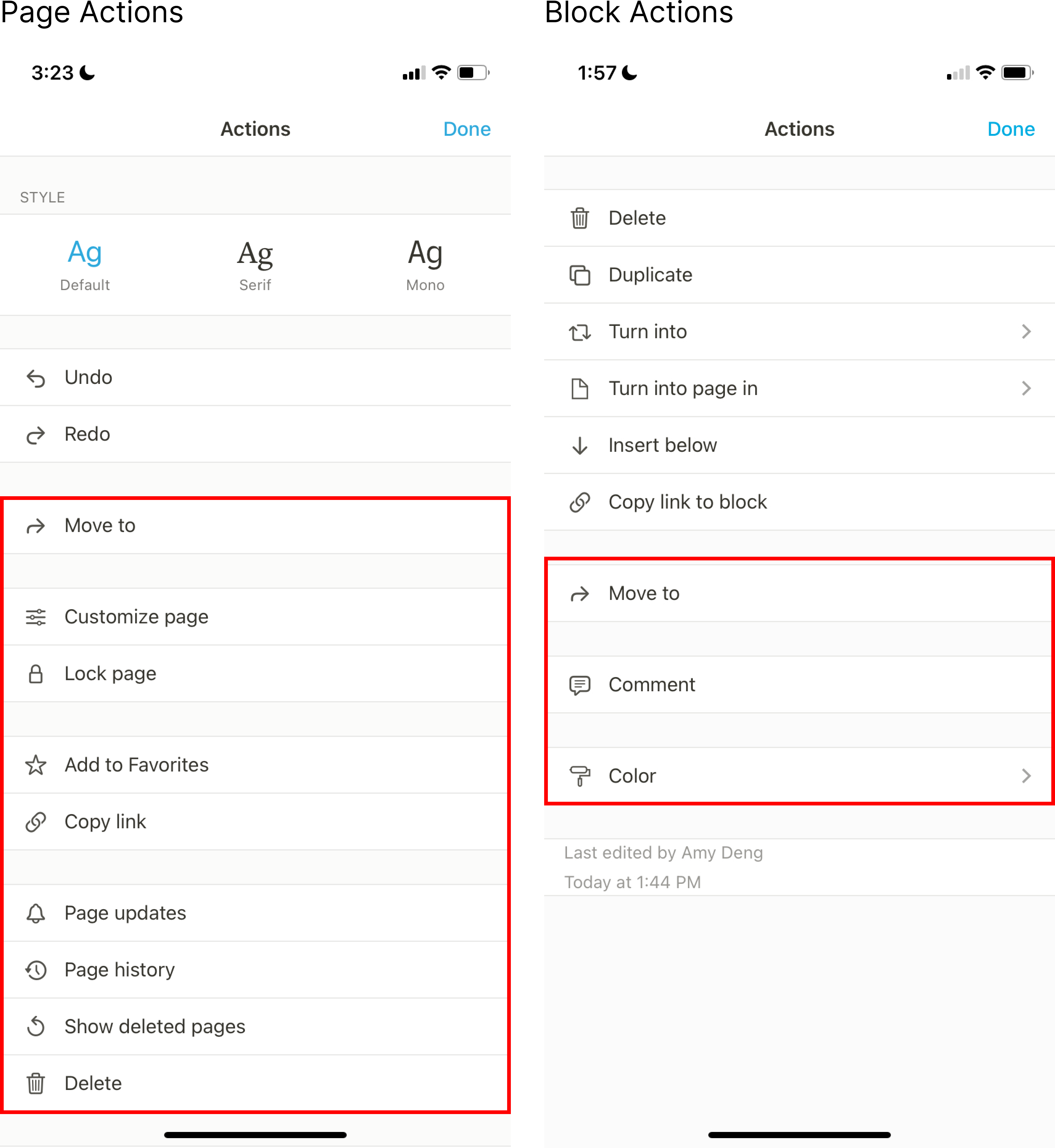
Simplify the action pages: Upon clicking the three dots, the action page pops up, takes the full screen, and cuts me away from the content I’m editing. I often need to exit the action page and double-check I am operating on the right page before I take the intended action. The layout of the action page is also odd: actions are segmented into unintuitive sections that don’t help users find what they need but rather create lots of empty spaces and lines that make skimming difficult. Finally, block and page action pages both have the same title “Action,” making it hard for me to distinguish them.
Inspirations & Visual Exploration
I took inspiration from apps that offer a much better composition and note-taking experience, including Google Docs, Bear (my go-to note-taking app), and Apple Notes. Specifically, I examined how they deal with toolbars, organize styling options, distinguish edit and view modes, and present action pages.

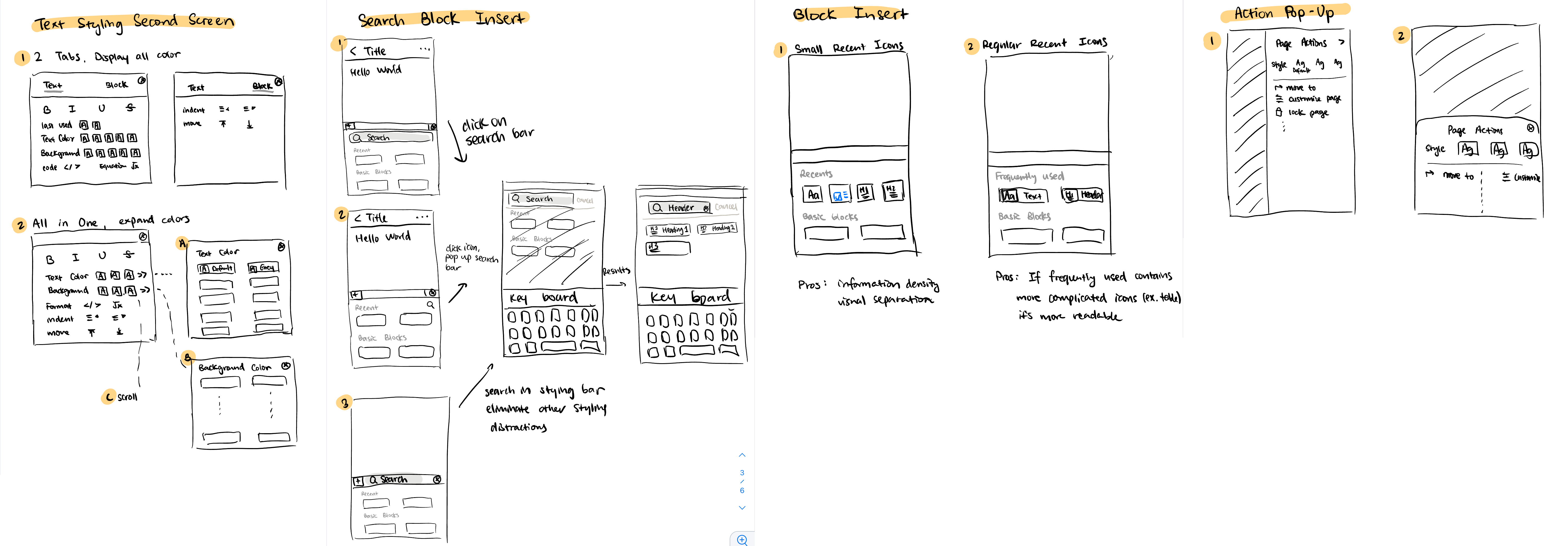
Then, I made some sketches to experiment with different options and user workflows. Low-fidelity sketches were extremely helpful for providing the visual input needed for me to make the final design decisions!
The New Look!
Overall, the redesign makes the interface less cluttered thus offering a focused note-taking experience like Notion desktop. My design makes it simple and convenient for users to find everything they need with regard to styling and block actions. View my Figma files here.
Decluttered toolbar: the default toolbar is made simpler yet still prioritizes the most used features. I rearranged text and paragraph styling options such as bold, underline, and text colors in a second screen so that users no longer need to scroll through a tiny toolbar to find what they need. Relevant styling options show up at the front of the toolbar when we edit an indented block or when text is selected. One caveat of the new design is that it’s not accessible to color-blind users since there’s no longer text accompanying the colors. But this can be mitigated by having an option at the end of the color options to display a similar interface as the original design.

Display frequently used blocks and allow search while adding blocks: Frequently used blocks now show up on the top as icons for easy skimming, together with a search icon that leads to a separate search page. Now users can easily find and insert any block on mobile without scrolling through a long list!

Use the app-top bar to distinguish editing and viewing modes: While editing, redo and undo buttons are on the top of the page, making it very easy to revert any accidental, unwanted changes. I hid the share and view comment buttons for editing mode since they are actions that make more sense to take in viewing mode. I also removed the title on top during editing mode to give the users a more distractionless composition experience. Clicking the blue checkmark signals the end of editing mode and hides the keyboard. Then, the page title shows up on the app-top bar and share and view comment functionalities replace the redo and undo buttons.
Less intrusive action screen: I redesigned the action page so that users can still see partial page content while viewing action options. I also rearranged the action options to be more compact and clean.

Additional Thoughts - The Real Challenges of Notion on Mobile
Although my redesigns seem nuanced, the subtle improvement compounds due to users’ frequent interactions with these features while editing notion pages. However, I realized that perhaps the biggest barrier to replacing Notes or Keep with Notion for casual note-taking is the process of creating/organizing rather than editing pages. Notion has the following disadvantages because it’s not designed for casual note-taking:
The Notion app is slower to load
Notion has more complicated file structures and allows a deeper page hierarchy whereas Notes only has 1 folder layer. Notion users care about file organization, but it takes time to move or create a note to the right page location
Creating and deleting notes is not made bluntly simple on Notion, but it’s crucial to have an incredibly simple interface while taking notes on the go under time pressure.
Taking one more step back, this entire redesign is based on the assumption that users would more frequently use Notion’s mobile app to take or edit notes given that this process is made simpler. I made this assumption based on my personal intuition, but, perhaps, note-taking engagement will be marginal even if the user experience is optimized. Before the deeper issues such as latency and user habits are addressed, it will still be hard for Notion to significantly improve user engagement in their mobile app.
Conclusion
Given that I am a two-week-old designer, I am pretty happy with the outcome of this project. Thank you for reading this long post to the end - I hope you enjoyed my redesigns! As always, I appreciate any thoughts and feedback from designers or my fellow Notion lovers <3
If you’re interested in learning more about my meta-learning experiment or how I learned design in the past two weeks, please check out my other posts and reach out via email at dengk@berkeley.edu or Twitter @amydeng_